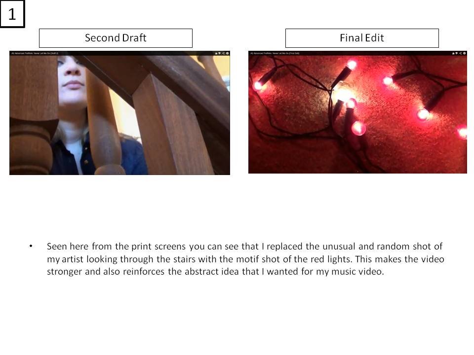
Friday 22 March 2013

Final Digipak and Magazine Advert

Digipak


After taking the feedback into consideration I used the natural elements idea and used a photo of some leaves which I then edited on Photoshop so that it went with the design and also didn't break the continuity. I also took more photos and found one which I could use as the back of my model. After making the necessary chances I found that the majority of people liked and thought the effect of having her front and back beside each other was an excellent effect and makes the product look professional. However as part of my brief the images I choose to include on my digipak has to have been taken by me so because of this I had to change the disc design from the polka dots to screenshots from my music video which fit with the my chosen themes.
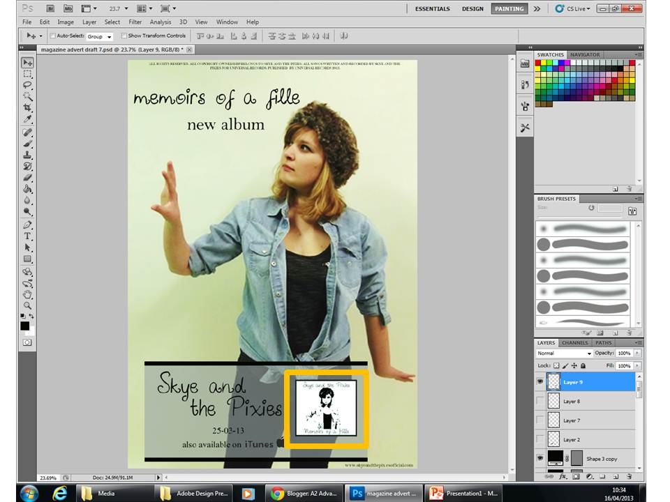


Magazine Advert


Having thought about making some more changes to my magazine advert I realised that most digipak magazine adverts had an image of the album cover on it to show the spectator/buyer what it looks like for if they choose to buy it they will know what to look for. I chose to put the cover next to the text '..available on iTunes' because of advertisement consideration they both interlink.


Wednesday 20 March 2013

Magazine Advert 4th & 5th Draft


Deciding to swap the 'Skye and the Pixies' title with the 'Memoirs of a Fille' made my magazine advert look more professional and of higher quality, having also added the 'new album' title shows the spectator that this is a new product.
 
I worked so that the image and text worked together, as you can see my artist is seen to be looking up at the text with a look of wonder, surprise and also curiosity. In my forth draft my artist is looking up at the name of her band however this didn't work well in my opinion, instead I chose to swap the two texts around so that my artist is seen to be looking at is the 'new album' text which reflects and reinforces the idea that the album is a product to have and one that hasn't been released yet; a 'thing to have'.
 
Also in draft five, after some more research into existing magazine adverts I found that most had music media players and applications advertisements where you will be able to buy, stream and download the music from, i.e. Amazon and Spotify so I chose to include the iTunes logo on my advert so the spectator will be able to access the music from home if they are unable to go to the music store.
 
I decided to change the font back to the one I used originally as it disrupted the continuity between the two ancillary texts (magazine advert and digipack).

Thursday 14 March 2013

2nd Draft Music Video


The feedback which I received told me to change and replace the shots where my artist is looking through the stairs as it had no relevance to the rest of my video and seemed to be randomly placed. I decided to replace the shot as they had no continuity with the rest of the video by using the red lights as they had become a motif throughout the video. I also decided to replace the shot where my artist is turning around while singing as I didn't particularly like the shot, it seemed too cliché for my video so decided to replace it with more abstract shots.

Monday 11 March 2013

Digipak 4th Draft


After receiving some feedback the majority of people thought that there was too much polka dot, after also seeing the music video they gave me the idea that I could include some natural images such as leaves or trees as I've used them repeatedly in my music video.
 
I will be retaking some photos as one person which I had asked had the idea that the photo on the front cover of the digipack I would retake the same photo but of the back of my model and put it onto the other side of the front cover so that it gives an abstract look and also to bring a hint of realism.

Tuesday 5 March 2013

Magazine Advert 2nd & 3rd Draft


I took the album cover of The Lumineers further and used the idea for my magazine advert, the black background with the white writing with picture being the focus. But instead of inverting the image I adjusted the levels to make the colours stand out more and make them more defined and sharp. 


Feedback which I recieved from this draft told me that the image I had chosen wasn't a strong enough image to be used on a magazine advert. I also found that it was slightly boring and didn't stand out as a magazine advert when put forward.

Digipak 3rd Draft

 
Taking the feedback into consideration I removed the image and replaced it with another black background however the digipack still didn't seem to be finished. So I decided to carry on the black and white theme and include some black and white polka dot backgrounds.

Digipak 2nd Draft

 
Taking the feedback which I had got from my first draft I made the necessary changes and found that my digipack was starting to look more professional however it still didn't seem to look like a digipak people would buy. After asking people what I could do to change it the majority said that I should remove the image of my artist as it looked randomly placed and didn't seem to fit in with the design.